New Retro Paint Colors
Explore Benjamin Moore’s “new retro” paint color palette, a celebration of influential color and design details of the ‘50s, ‘60s and ‘70s.
Project ideas & inspiration
New Retro Paint Colors
Explore Benjamin Moore’s “new retro” paint color palette, a celebration of influential color and design details of the ‘50s, ‘60s and ‘70s.
Project ideas & inspiration

We’re shaking up the concept of retro style by taking iconic design styles and blending them with a modern, eclectic kick. Pair thrift store finds with family heirlooms and contemporary touches to create a unique look that is distinctive to you.
Design inspiration for the new retro color palette includes:
- 1950s: Playful refreshing pastels, colorful appliances and bold tile patterns
- 1960s: Organic colors juxtaposed with bright curated hues and midcentury modern vintage décor
- 1970s: A mix of amped up earth tones and synthetic hues; shag, wicker and rattan
Weaving Retro Style with Natural Materials
Tap into ‘70s boho by using woven, natural materials in furniture, lighting fixtures and accessories. Textured touches like shag, macrame and rattan add warmth to any room.
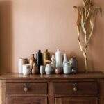
Natural elements pair beautifully with the rustic side of the new retro palette, from soft off-white Cloud Cover OC-25 to Mississippi Mud 2114-20 to golden York Harbor Yellow 2154-40.
Add a modern twist and pair breezy accessories with cool grays like Vapor Trail 1556, shown here.
If you dig the laid back, effortlessly cool vibes of the 1970s, it’s easy to recreate it in your home.
Use a comforting color palette of earth tones centered around dark brown Mississippi Mud 2114-20, paired with any combination of Clay Beige OC-11, Cloud White OC-130, Bennington Gray HC-82, and Sussex Green HC-109.
Accent with Saturated Paint Colors
Beyond the earth tone colors of the ‘70s is the wilder, more surreal color palette of the decade. Add floral patterns, squiggly lines and sturdy synthetics for far out, maximalist style.
Here, bold Smoldering Red 2007-10 on the door and cheery Woodland Hills Green 543 on the bookcase provide complementary, high contrast color and nostalgic feels.
The furniture-like finish for the door and bookcase shown here comes by way of ADVANCE® Interior, a premium paint recommended for deluxe cabinets, trim, doors and more.
Curved, Colorful Furniture
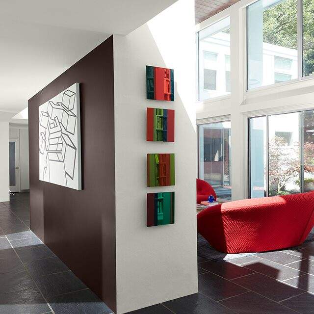
Synonymous with midcentury modern design, the 1960s found soft, curved couches and chairs in bold hues as a new living room mainstay. Our new retro paint color palette synergizes beautifully with this decade’s iconic furnishings.
For furniture in warmer hues like red, orange, yellow, consider First Light 2102-70, Shaker Beige HC-45, and White Opulence OC-69 (shown here).
Furniture in cooler hues like green, blue, and purple pair beautifully with walls in Palladian Blue HC-144, Cloud Cover OC-25, and Metropolitan AF-690, a former Benjamin Moore Color of the Year.
Clean Lines Meet Monochromatic Paint Colors
Sleek, monochromatic paint colors beautifully accentuate the clean lines of midcentury modern design.
Case in point: This home office combines Palladian Blue HC-144—a warm blue-green, with Van Deusen Blue HC-156, which provides vibrancy and depth. A sleek desk, tulip™ chair and sunburst clock round out the 1960s vintage charm.
Other monochromatic color pairings we recommend include:
- Sophisticated & Light: White Dove OC-17 and Seapearl OC-19
- Sunbaked Neutrals: Bar Harbor Beige 1032 and Clay 1034
- Saturated & Sleek: Yukon Green 2051-10 and Misted Green 2138-50
Pales, Pastels and Pink: ‘50s Dreaming
Playful pastels and refreshing pales say 1950s—with pretty pinks in the spotlight.
From punchy bubblegum hues to blushed petal pinks, pink is a feel-good color that plays a starring role in our new retro palette, thanks to First Light 2102-70, a former Benjamin Moore Color of the Year.
If an all-pink look isn’t quite right for you, try pairing pink with softer neutrals for a more subtle, contemporary approach to this retro look.
Pink and neutral pairings we love include:
- Heather Pink 2091-60 and Muslin OC-12
- Gentle Butterfly 2173-70 and Silver Song 1557
- First Light 2102-70 and Thunder AF-685, from our fan-favorite Affinity® collection (shown here)
Painted Checkerboard Floor: A Modern Twist
The classic checkerboard floor instantly evokes retro vibes. Prevalent in 1950s American diners, this look is commonly found in kitchens and achieved with tile or linoleum.
Use paint to take a more creative approach to the checkerboard floor and swap colors out during a DIY weekend project. Go for classic black and white, or switch it up with more vibrant hues. We love checkerboard floors in entryways and mudrooms for a cheerful, nostalgic welcome.
In this hallway, dark gray and off-white pair beautifully for a modern twist. Glass Slipper 1632, a soft, powdery blue-gray on the window trim and painted doors, round out the retro look.
Social Media Snapshot: New Retro
Check out these sleek styles from homeowners and designers who used Benjamin Moore paint to bring their own twist on retro style to life.


